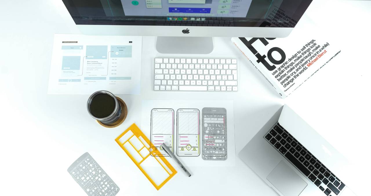
Each year the number of mobile device users is growing. For that reason it’s become more important than ever to ensure that your mobile application is both unique and user-friendly. Creating a clear UI and UX design might help you achieve this goal.
Table of Contents
Experience Is The Key
There are more and more users of mobile devices each year. That creates a high demand for applications that work on Android and iOS software. The competition makes it difficult to stand out, so it’s important to take your decisions wisely when releasing your app on the market.
You have only one chance to make a good impression on a potential user and if you don’t take it, they will never come back. The first rule to consider is that your project should be designed in a purpose-focused way. For this reason, experience on the market is the best quality that a software house can have. A professional team knows how to adapt a project to a certain area or sector. An e-commerce app will be very different from banking software.
Nevertheless, there are some general rules for a good UI that can be applied to most application designs. The first piece of advice for UI developers is to create responsive layouts in React Native, which is a way to deal with several types of Android devices. In that way the layout is always compatible with all of them. You can read more about responsive layouts in React Native.
Make It Simple
Users expect different types of experiences depending on the type of application, but there are some general rules to be applied to every project when it comes to a clear UI.
First of all, just scratching the surface reveals that it’s all about the user’s experience. And to make sure that your UX is positive, you’ve got to listen to users… or your common sense. The application should be just like the ones that you personally recommend. But how to put it into words exactly?
To make your interface clear and the user interaction smooth, it should generally be minimal. It’s also a good idea not pack the screen with more than 2-3 actions at the same time. Don’t make the colours too vivid and, for the best results, don’t use more than 3 totally different shades. Also, white space is your best friend if you want to bring clarity to the whole project and create contrast for the best content legibility. Make sure that the fonts and icons are fairly simple and not too exaggerated, as this will confuse the user and make it more difficult for them to carry out their desired action. Quick and easy navigation is key to successful UI design, so make sure that this tab is always visible in every part of your application.
The last bit of advice is to make the best contrast balance for your application. Of course, this depends on the colours and white space used in your design, but it only takes a few tests to know which setting is best.
Make It Dynamic
Research has shown that users don’t spend more than 5-6 seconds to read text that doesn’t catch their interest. For that reason, all texts longer than a couple of sentences should be collapsed, only showing a short preview. The user might decide to expand them if they find the content interesting. This saves a massive amount of scrolling and digging through the content that isn’t relevant for the user. This advice is especially useful for any news or social apps but also for any app that posts notifications for its users. To make the experience even more dynamic, be sure to eliminate chances for the user to make a mistake. For instance, all tap targets should be distanced from each other to avoid an accidental action. If a user makes a mistake a few times, the risk is high that they will abandon your application for good.
The next piece of advice is especially relevant nowadays as mobile phones are getting bigger. Remember to design your application with consideration for the reach of a human palm. An average one is about 10-10mm long so try not to put any important tap targets at the edges of the screen. Smartphones such as the iPhone 6 and iPhone 6Plus make it especially difficult to design convenient UI for users. Nevertheless, their dimensions must be taken under consideration when creating the best UX for those devices.
Hopefully we have included some advice that will help developers with their UI design.
Also Read: The Most Widespread Pitfalls In Mobile Application Development
